| May 2006 Index | Home Page |
Editor’s Note: This is a detailed and exacting study of display factors that influence learning from a computer screen. This data has value for instructional designers since the results differ from Eastman Kodak’s data for visual projection and the Ford Foundation specifications for television viewing. It also incorporates research on complexity and aesthetic values.
Web-Based Distance Learning Technology:
Interface Design Variables and their Effects
Cristina Pomales-García and Yili Liu
Purerto Rico & USA
Abstract
This research measured simplicity, visual attractiveness, organization, clarity, and excitement factors in a Web-based distance learning (WBDL) environment where multimedia such as audio, video, figures and text were displayed simultaneously on the computer screen. Thirty-three simulated Web-based instructional modules with different interface design characteristics (information delivery modality, color of text and figures, and slide text font size) were evaluated through a controlled experimental study. The results showed that Web modules with instructor video, use of color words in slides with text, and text font size 14 had higher ratings of simplicity, visual attractiveness, organization, clarity, and excitement. This study provides empirical evidence to support the importance of appearance in the design of WBDL environments and demonstrates that guidelines in screen design could be applied to WBDL design.
Keywords: Web-based distance learning environment, distance learning screen design, user preferences, aesthetics, multimedia, Web-based instructional modules
Introduction
Web-based distance learning (WBDL) technology is playing a more and more important role in education, and it is important to understand how interface design variables such as screen layout and organization may affect the appearance and usability of the WBDL technologies. Stewart, Hong, and Strudler (2004) found appearance and structure of Web-pages to be an important factor related to the quality of Web-based instruction. Zhang and von Dran (2000) considered layout as a visual attractiveness factor that enhances user satisfaction. Other researchers have also emphasized the role of layout in design.
Layout is a publication design term used to refer to the planned visual arrangement of text elements on a page or screen (Grabinger 1989). Brink, Gergle and Wood (in Darlington 2005) proposed a set of guidelines for page layout design, including consistency, simplicity, focus, use of metaphors and functional stability. Tullis (1983) suggested that the most desirable screen features are simplicity, clarity and understandability. A visually pleasing composition or design aesthetic is defined as attractive to the eye, drawing attention subliminally, conveying a message clearly and quickly; and simplicity is defined as a combination of elements that results in ease in comprehending the meaning of a pattern.
Grabinger and Amadeo (1988) conducted an experiment in which 31 participants sorted a sample of text types according to their “study-ability”—the ease with which text in cathode ray tubes (CRT) displays could be read and studied—to understand which design variables are related to the comprehensibility of text. The results showed the advantage of arranging test materials in ways that support perceptions of structure, simplicity and organization. In this study, structure was described by text designs that indicate a hierarchical and systematic arrangement of subject material with isolated headings, spaced paragraphs and directive cues (underline, italics, and bold type). Simplicity was described by designs with presenting narrow text (45 characters), with double spacing and organized paragraphs. Organization was described as text with a block scheme, and including a heading at the top of the page. The authors suggest that these factors contributed to a feeling of ease, spaciousness and simple manageable text.
Ngo (2001) developed a mathematical model to describe thirteen different spatial properties of a multi-screen interface and determine how these different properties relate to the aesthetic value of a screen. One of these properties is simplicity, which is defined as the extent to which component parts are minimized and the relationships between the parts are simplified. Bauerly and Liu (2003, 2006) conducted computational modeling and experimental evaluation work on quantifying the effects of number of components, grouping, symmetry, and balance on interface aesthetics. The concept of minimizing the components of a screen is similar to several other related ideas including Tullis’ (1983) idea of counting the total number of fields in a screen and choosing screens with minimal number of fields, Grabinger and Amadeo’s (1988) feeling of “spaciousness”, Brink, et al. (in Darlington 2005, 49) “keeping the page structure simple and uncluttered”, and Nielsen’s (2000) use of white space to guide the eye and help users understand the grouping of information. Nielsen (2000) suggests that content should account for at least half of a page’s design, and preferably closer to 80 percent. When designing Web pages some general design guidelines should be followed, including using meaningful headings, bulleted lists to break the flow of uniform text blocks, and highlighting and emphasis (color text and underline) to make important words catch the user’s eye.
Grouping or organization is another important factor in screen design. Grabinger and Amadeo (1988) found “organization” to be one of the group perceptions. With respect to design, line borders can greatly enhance groupings of information and direct the viewer’s eyes in the required direction of information scanning. Thacker (in Galitz, 1993) found that displayed information with a border around it was reported to be easier to read, better in appearance and preferable.
A series of experiments by Champness and De Alberdi (1981) were designed to uncover the main factors of judgment people use when they evaluate teletext pages, assess the extent to which slide presentation of pages produces similar responses as presentation by TV, and assess the effect of specific designs of pages on users’ subjective reactions. Participants sat in front of a TV screen and were presented with a succession of teletext pages. They were given memory tests after seeing pages for a fixed length of time and asked to rate further pages on seven-point rating scales. Results showed that attractiveness, clarity and usefulness were the three main factors of user reaction. The researchers found that these factors were stable across both situations and methods of presentation. Both individual scales and factors were extremely sensitive to changes in page design, in a meaningful and useful way. The authors conclude that the way information is presented on a page does not just affect how pleasing it is to the eye but it also affects the time to read it. They suggest that paragraphing or segmenting text along with underlining, color and bullets to provide emphasis are important to improve ease of reading.
Web-based modules used in distance education include many different formats and media. For text presentation, it is recommended to include no more than 40-60 characters on each line, to separate paragraphs by at least one blank line, and emphasize important things by bold typefaces. According to Galitz (1993) using bold to emphasize important things makes the screen more interesting. When creating text in PowerPoint it is recommended to consider the distance between the display and the student and use font size between 24 and 36 to increase legibility. This creates a problem because material used for a regular face-to-face class using font sizes larger than 24 might be larger than needed in Web-based modules. Grabinger and Amadeo (1988) also found that simplicity was described by designs with narrow text (45 characters). Based on this idea, in our study we expect to find designs with font size that averages 40-60 characters per line to be more appealing, simpler and exciting than designs with larger font sizes.
Purpose
The research literature, as reviewed above, suggests that several factors or aspects of design should be taken into consideration when designing Web screens. These factors include simplicity, visual attractiveness, organization, clarity, and excitement. Previous studies have measured these factors in screen displays, teletext, and TV environments. Our study measured these factors in a Web-based educational environment where multimedia such as audio, video were displayed simultaneously with figures and text on the computer screen. The purpose of this study was to conduct a controlled experimental study to evaluate and systematically measure perceived ratings for these factors based on different Web module design characteristics (information delivery modality, color of text and figures, and slide text font size). This study will provide empirical evidence to support the importance of appearance in design of WBDL environments and understand how guidelines in screen design and multimedia could be applied to the design of WBDL environments. In this paper, the following questions are addressed:
What is the relationship between interface design features (color, font size and information delivery modality) and ratings for each factor?
Does the principle of simplicity-complexity apply to WBDL modules? What is the relationship between number of fields in a screen and ratings of simplicity-complexity in a WBDL module?
Based on the literature review, we expect to find the following results:
Modules with text modality and small font have a larger number of fields, and will therefore be perceived as more complex and generate lower simplicity ratings using magnitude estimation ratio scale.
Modules with an average of 40-60 characters per line will be considered to be more appealing, clear and organized than designs with less number of characters per line.
Experimental Methods
Participants
Sixteen engineering students between the ages of 18-22 years participated voluntarily in the experiment (8 females and 8 males). All students were enrolled undergraduate students at the University of Michigan, College of Engineering, in Ann Arbor. Participants were paid $15 each for 1.5 hours of their time.
Web Modules
Thirty four images, simulating WBDL modules, were created using PowerPoint. These images were created with different information delivery modalities, color of text and figures in the course slides, and slide text font size. Two types of similar layouts were designed based on the information delivery modality variable. Information delivery modality corresponds to the use of video, audio only or transcription text of the course material, displayed on the left side of the screen. Figure 1 shows the general layout within a Web module and how the module layout changes with the different types of information delivery modality. In Figure 1, A indicates the area of the display with video and audio with player controls. C is the area with the table of contents for modules with video or audio, D corresponds to the area where transcription of course audio appears when there is no audio or video, and B is the location of the course slides or material, which are PowerPoint slides.

Figure 1. Basic structure of Web module screen layout.
Information delivery modality was represented in the Web module in one of three different ways: (1) a color picture and audio player controls simulating a course lecture with video and audio; (3) audio player controls to simulate modules with course audio only, or (3) a text transcription of the course audio. Figures 2 shows three examples of simulated Web modules used in the experiment with the three different information delivery modalities. All examples include standard headings and different slide content (right side of module) with either figures (Figure 2(a)) or text (Figure 2(b)-(c)). Course material was simulated using either slides with text or figures. In modules where slides with text was used, the text was organized in bullets, with the text either in all black fonts or with selected words in color or bold font. The words in color were not bold. Slides with figures were represented by a graph in either grayscale or color, using the same set of colors used for color text. Color used for the slides were, red (HEX code #0000CC), green (HEX code #000080), and blue (HEX code #3333FF). In modules with text on the slides, only one color was used per bullet if there were more than one highlighted word. Font size in bulleted text was either small (14-point), medium (16-point) or large (18-point) using a sans-serif Arial font.
A total of 34 original images (test stimuli) were designed using all combinations of design variables. The “modality*figure” combination (a 3x2 design) produced 6 different module combinations, and the “modality*text color*font size” combination (a 3x3x3 design) produced 27 modules. An additional benchmark image was created using audio modality and a slide with text in block format, no bullets, and left justified. As described below, the benchmark image was used solely as the baseline for generating subjective ratings on other images.
Experimental Procedure
The experiment was conducted in a well-lit (approximately 21 footcandles) laboratory. As shown in Figure 3, participants sat at a desk facing two 17-inch LCD monitors at 1024 x 768 pixel resolution. Power Point was used to display the simulated WBDL modules, one at a time in slide-show or full screen mode.
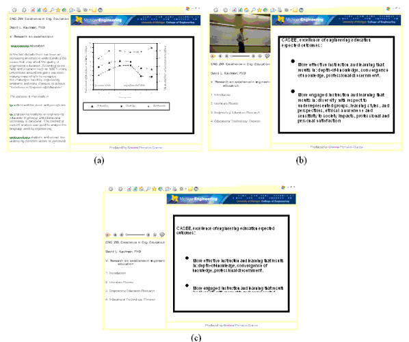
Figure 2. Examples of simulated Web-modules with different information delivery modalities: (a) text, (b) video, and (c) audio. All images include standard headings and sample slides (right side of module) with either figures (a) or text (b and c).

Figure 3. Location of computer screens with respect to participant.
Data was collected by manually recording verbal responses to standard questions about each image. Each participant was instructed avoid thinking too much about their responses, and to take into account the different types of information delivery modality (audio, video or text) while disregarding the content or topic of the slides. He or she was asked to compare each of the 34 simulated modules to the benchmark module on different perceptual factors. In this process the participants also compared the baseline to itself although the results for this rating were not included in the results. Their task was to rate each design using the method of ratio-scale magnitude estimation. At all times the benchmark image (baseline magnitude rating of 10) was presented to the left (Screen #1) of the test image (Screen #2). The set of questions asked participants the following: “The module on your left contains the same material as the module on your right and it represents a _____ (factor) rating of 10. How much more _____ (adjective) is the Web module shown in the computer screen on the right?” Table 1 lists the different factors and corresponding adjectives used to complete the blanks for the set of questions. All simulated Web modules were rated on one factor at a time until all 34 modules were rated for each of the 5 factors. The order in which the factors were presented was randomized between participants.
Table 1
Factors used by participants to rate the simulated Web-modules
Factor | Adjective |
Simplicity | Simple |
Organization | Organized |
Visual/aesthetical attractiveness | Aesthetically appealing |
Excitement | Exciting/interesting |
Clarity | Clear |
Data Analysis Methods
A mixed model within-subject ANOVA was used to analyze the data. The nature of the experimental design allowed the data to be restructured into different models. The dependent measures were perceived ratings for the different factors (clarity, simplicity, organization, attractiveness and excitement), using ratio-scale magnitude estimation. The independent variables were slide content (figure and text), slide content color (black, color and bold), slide text font size (small, medium and large), and information presentation modality (audio only, video with audio, and text). Model 1 was designed to study the effects of modality, slide content color and size on modules with text on the slides only (3x3x3 design). Model 2 examined the effects of modality and slide content color on modules with figures on the slides (3x2 design). Model 3 was designed to study the effects of modality, and slide content color on modules with text and figures on the slides (called slide content variable) (3x2x2 design). In both models 2 and 3, the variable representing slide content color had only two levels as figures were only designed in grayscale or color, and the bold variable was eliminated. Also in these two models font size was not considered in the analysis. SAS 9.1 software was used as the data analysis tool.
To compare the measured simplicity ratings with the complexity of the design, Tullis (1983) measure of screen complexity was incorporated. This technique was originally used to measure text screens and we have adopted it for more complex displays with text and images. Measuring complexity involves the following three steps: (1) draw a rectangle around each field on the screen, including captions, data, title, etc. and count each one as a general field; (2) count the number of columns in which a field, inscribed by a rectangle, starts (horizontal fields); (3) count the number of rows in which a field, inscribed by a rectangle, starts (vertical fields). To compute the total number of fields the results of these three steps are added together. Figure 4 shows a simplified Web module (similar to the modules used in this experiment but with reduced number of lines with text) with the rectangles around each field.
In our study the navigation bar, the upper and lower banner by the slide area, and the audio player controls are considered “fields” as they are inscribed by rectangles. Based on the characteristics of Figure 4 there are 21 general fields, 18 horizontal fields and 5 vertical fields, for a total overall complexity value of 44.
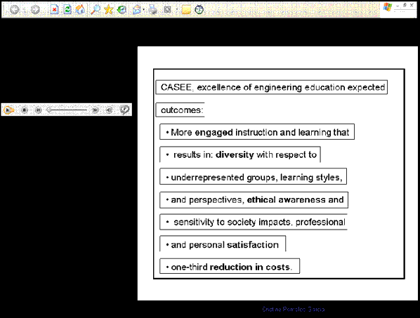
Figure 4. Sample Web module with identified fields
(rectangles) used in complexity calculation
Results
The results of the within-subject ANOVAs for the different models and measured factors are shown in Tables 2 thru 7. As mentioned in the method section, model 1 represents the analysis for modules with text on slides, model 2 is for modules with figures on slides and model 3 corresponds to the analysis of modules with text or figures on the slides. Result tables show only the main effects of modality, color, size, and slide content (figures or text) as there were no significant 2-way interactions between the independent variables.
Perceived clarity
Analysis of the results for clarity ratings (Table 2) showed significant differences between information delivery modality, color and font size (only modules with text). To better understand which of these variables were different from each other a paired t-test using Bonferroni adjustment was used.
Table 1
ANOVA results for perceived clarity
Effect | Model 1 | Model 2 | Model 3 | |||||||||
Num DF | Den DF | F Value | Pr > F | Num DF | Den DF | F value | Pr > F | Num DF | Den DF | F value | Pr > F | |
Modality | 2 | 30 | 40.73 | <.0001 | 2 | 30 | 11.84 | 0.0002 | 2 | 30 | 10.70 | 0.0003 |
Color | 2 | 30 | 19.17 | <.0001 | 1 | 15 | 8.72 | 0.0099 | 1 | 15 | 11.74 | 0.0037 |
Slide content | N/A | N/A | 1 | 15 | 0.00 | 0.9493 | ||||||
Size | 2 | 30 | 21.29 | <.0001 | N/a | |||||||
For modules with text only (model 1) the three information presentation types (audio, video and text) were significantly different from each other, with video modality having higher clarity ratings. In modules where only figures were analyzed (model 2) or both text and figure modules were compared (model 3) on the perceived clarity ratings, modules with audio and video delivery modality were not significantly different from each other. On the other hand, video and audio modules were significantly different from text. Another important result was finding no significant difference in clarity ratings when comparing modules with text and figures. With respect to font size on modules with text only there was no significant difference between small and medium font size and black and bold text color.
Perceived organization
With respect to ratings of organization of the Web modules evaluated, all the modules showed significant differences in information delivery modality, color, size and slide content (Table 3). For the three models examined the three information delivery modalities were significantly different from each other according to the paired t-test using Bonferroni adjustment. In general video had higher ratings than audio, and audio had higher ratings than text delivery modality. Similar to the analysis of perceived clarity, in the ratings for perceived organization was no significant difference between small and medium font size and black and bold text color.
Table 2
ANOVA results for perceived organization
Effect | Model 1 | Model 2 | Model 3 | |||||||||
Num DF | Den DF | F value | Pr > F | Num DF | Den DF | F value | Pr > F | Num DF | Den DF | F value | Pr > F | |
Modality | 2 | 30 | 49.21 | <.0001 | 2 | 30 | 23.06 | <.0001 | 2 | 30 | 28.48 | <.0001 |
Color | 2 | 30 | 14.11 | <.0001 | 1 | 15 | 14.87 | 0.0016 | 1 | 15 | 21.20 | 0.0003 |
Slide content | N/A | N/A | 1 | 15 | 9.68 | 0.0071 | ||||||
Size | 2 | 30 | 45.83 | <.0001 | N/a | |||||||
Perceived simplicity
The analysis of simplicity ratings (Table 4) showed significant differences in delivery modality across all the different models. For modules with only text on the slides there were significant differences in color and font size. The results for a paired t-test using Bonferroni adjustment showed that for modules with text only the three delivery modalities were significantly different from each other. For modules with figures only or modules that compared text and figure, simplicity ratings showed no difference between text and audio, and audio and video. The only delivery modalities that were considered to be significantly different from each other when analyzing modules with figures were those with text and video modality. With respect to color there was no significant difference in use of color on modules with figures only. This suggests that use of color does not make a figure complex or simpler, but might make it more organized and clear based on the results of other factors. Similar to clarity ratings, perceived simplicity ratings showed no significant difference in modules with text and figures (model 3) therefore these two variables in our study were considered to be equally clear and simple.
Table 3
ANOVA results for perceived simplicity
Effect | Model 1 | Model 2 | Model 3 | |||||||||
Num DF | Den DF | F value | Pr > F | Num DF | Den DF | F value | Pr > F | Num DF | Den DF | F value | Pr > F | |
Modality | 2 | 30 | 25.70 | <.0001 | 2 | 30 | 4.77 | 0.0160 | 2 | 30 | 4.70 | 0.0168 |
Color | 2 | 30 | 13.25 | <.0001 | 1 | 15 | 2.29 | 0.1514 | 1 | 15 | 4.97 | 0.0415 |
Slide content | N/A | N/A | 1 | 15 | 0.50 | 0.4906 | ||||||
Size | 2 | 30 | 30.33 | <.0001 | N/a | |||||||
As expected, simplicity calculations for the simulated WBDL modules in this experiment
(Table 5), show that as the number of fields increases the design is considered to have higher complexity (less simple). In our study, those modules, with an overall lower total number of fields (calculated) were the ones with higher (measured) simplicity ratings. Modules with video modality and figure in the slides had higher simplicity ratings as well as the lowest complexity calculations. Independent of the information delivery modality, the modules with the largest number of fields correspond to those with text in slides and font size 18, and these modules were given the lowest simplicity ratings. Complexity calculations based on Tullis’ (1983) guidelines does not takes into account color in the display as color has no effect on the size or spacing of the text. Between the calculated and measured values, on average the text only slides with large font had the lowest simplicity ratings and highest complexity calculations. With respect to modules with audio and video modalities, the results were inconclusive as calculations were similar to each other and for font size, the measured values were not different between small and medium size text.
Table 4
Measured and calculated values for simplicity based on the design variables
| Slide Content (text or figure) | Calculations (based on Tullis, 1983) | Mean Simplicity Measured Ratings (0-100) | |||
Fields | Vertical | Horizontal | Overall Total | |||
Text | Small | 46 | 11 | 39 | 96 | 15 |
Medium | 49 | 11 | 40 | 100 | 14 | |
Large | 50 | 11 | 41 | 102 | 11 | |
Figure | 37 | 13 | 34 | 84 | 14 | |
Audio | Small | 30 | 10 | 25 | 65 | 16 |
Medium | 33 | 10 | 26 | 69 | 17 | |
Large | 34 | 10 | 26 | 70 | 13 | |
Figure | 21 | 12 | 19 | 52 | 17 | |
Video | Small | 31 | 10 | 25 | 66 | 18 |
Medium | 34 | 10 | 26 | 70 | 18 | |
Large | 35 | 10 | 26 | 71 | 15 | |
Figure | 22 | 12 | 19 | 53 | 19 | |
Perceived attractiveness
Analysis of results for attractiveness ratings (Table 6) showed a significant difference in information delivery modality, color and font size in modules with text only (model 1), similar to other measured factors. Comparing modules with text and figures on the slides (model 3), there were significant differences in information modality, color and slide. The paired t-test with Bonferroni adjustment showed that for modules with text only (model 1) modules with text and audio modality had similar attractiveness ratings but when modules with figures only (model 2) were analyzed all delivery modalities were significantly different from each other. Comparing modules with text and figures on the slides for perceived attractiveness, ratings were higher for modules with figures (mean rating=20.4) than for modules with text on the slides (mean rating=16.9). Similar to simplicity ratings, there was no significant difference in color for modules with figures on the slides (model 2).
Table 5
ANOVA results for perceived attractiveness
Effect | Model 1 | Model 2 | Model 3 | |||||||||
Num DF | Den DF | F value | Pr > F | Num DF | Den DF | F value | Pr > F | Num DF | Den DF | F value | Pr > F | |
Modality | 2 | 30 | 50.16 | <.0001 | 2 | 30 | 18.80 | <.0001 | 2 | 30 | 29.99 | <.0001 |
Color | 2 | 30 | 16.39 | <.0001 | 1 | 15 | 2.41 | 0.1415 | 1 | 15 | 13.44 | 0.0023 |
Slide content | N/A | N/A | 1 | 15 | 22.17 | 0.0003 | ||||||
Size | 2 | 30 | 12.63 | 0.0001 | N/a | |||||||
Perceived excitement
The analysis of results for excitement ratings (Table 7) showed a significant difference in information delivery modality, color and font size in modules with text only (model 1). Comparing modules with text and figures on the slides (model 3), information modality, color and slide content were significantly different from each other. Using a paired t-test with Bonferroni adjustment to understand which of these variables were different from the results, it was observed that independent of the slide content there were no significant differences between text and audio delivery modalities. Similar to attractiveness ratings, when comparing modules with text and figures on the slides, mean ratings were higher for modules with figures (mean rating=18.2) than for modules with text on the slides (mean rating=15.7). Also, similar to simplicity and attractiveness ratings, there was no significant difference in color for modules with figures on the slides (model 2).
Table 6
ANOVA results for perceived excitement
Effect | Model 1 | Model 2 | Model 3 | |||||||||
Num DF | Den DF | F value | Pr > F | Num DF | Den DF | F value | Pr > F | Num DF | Den DF | F value | Pr > F | |
Modality | 2 | 30 | 52.27 | <.0001 | 2 | 30 | 11.85 | 0.0002 | 2 | 30 | 17.72 | <.0001 |
Color | 2 | 30 | 17.34 | <.0001 | 1 | 15 | 3.09 | 0.0992 | 1 | 15 | 10.71 | 0.0051 |
Slide content | N/A | N/A | 1 | 15 | 9.75 | 0.0070 | ||||||
Size | 2 | 30 | 9.75 | 0.0005 | N/A | |||||||
Across the five measured factors, there were significant differences between delivery modality, color and size for the modules with text only (model 1). Similarly, the analysis for modules with figures only (model 2) show significant differences in delivery modality across the five measured factors. Different from modules with text only, for modules with figures only, there were significant differences in color for perceived clarity and organization factors. For both of these factors figures in color had higher mean ratings than figures in black and white (Figure 5). For the factors of perceived simplicity, attractiveness, and excitement there was no difference in using color or black and white figures.
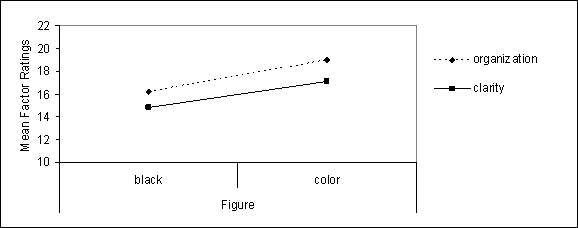
Figure 5. Mean ratings of figure color for perceived clarity
and organization factors in modules with figures only.
When Web modules with both figures and text in the slides were analyzed (model 3), there were significant differences in delivery modality, color for all the measured factors. With respect to slide content only for perceived organization, attractiveness and excitement factors there were significant differences between slides content. The results suggest that with respect to simplicity and clarity presenting the information using text or figures makes no difference. But, ratings of organization, attractiveness and excitement (Figure 6) suggest that figures were preferred over text.
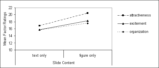
Figure 6. Mean ratings of modules with text and figures on the slides
for perceived organization, attractiveness and excitement factors.
Figure 7 shows a summary of the results for independent variables tested in the study. The results for modality, color and font size were based on mean results for modules with text on the slides (model 1). The results for slide content show the differences in the ratings for the factors as reflected in the paired t-test, where there was no significant difference between simplicity and clarity ratings, but a significant difference between the ratings for perceived organization, attractiveness and excitement factors.
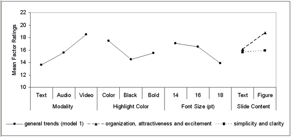
Figure 7. Summary of results for modality, slide content color,
font size and slide content variables.
The text used in the slide content was the same for all WBDL modules, which included a total of 578 characters. The different font sizes studied changed the number of lines of text in each simulated slide. Table 8 shows the font size used in the WBDL modules, the number of measured lines with text and the average number of characters per line.
Table 7
Average number of characters per line based
on measured number of lines and font size
Variable Name | Small | Medium | Large |
Font size | 14 | 16 | 18 |
Measured number of lines with text | 12 | 15 | 16 |
Average number of characters per line (Total /Average number of characters) | 48 | 38.5 | 36 |
According to the calculations shown in Table 8, the types of modules that fit the profile of 40-60 characters per line were those with small font size (Arial 14pt). Across the board, for the analysis of all each of the factors, there was a significance difference between font size for modules with text on the slides. Analyzing which one of the variables differ from each other showed that there was no significant difference between small and medium font size, and both 14 and 16pt font were different from 18pt font. In general, as shown in Figure 5., 9 designs with small (14pt) text were rated as more attractive, clear, exciting, simple, and organized when compared to designs with larger font size.
Discussion
Usability is an important aspect of Web design and one of the goals of the usability principle is to incorporate the users into the design process. According to the literature clarity, organization, excitement, visual/aesthetical attractiveness, and simplicity are important design factors within Web environments. In the process of evaluating the display designs it is important to understand how the users perceive the factors that will be measured. Results for simplicity showed that with respect to color there was no significant difference in use of color on modules with figures only. The results of this study, suggests that use of color does not make a figure complex or simpler, attractive or exciting, but might make it more organized and clear based on the results of other factor ratings. According to the literature there are many definitions or aspects that represent simplicity, including font and spacing (Grabinger and Amadeo, 1988), bullets and color (Nielsen (2000), navigation and interaction (Darlington, 2005), comprehension and appearance (Galitz, 1993), and the amount of information on the display (Darlington, 2005; Galitz, 1993; Ngo, 2001; and Nielsen, 2000). In this study amount of information of the display was measured (complexity) and compared to ratings of simplicity but this measure of complexity does not takes directly into account variables like color, use of bullets, font and spacing, which might have been taken into consideration by our sample to rate Web module simplicity. On one hand the literature review suggested that different aspects are emphasized for every factor and not all of the factors are taken into account when evaluating design characteristics. Asking participants to define what characteristics of the design they focused on to rate each factor would give us more insight to understand the differences between student definitions and literature descriptions and develop a more unified, qualitative and quantitative description of each factor incorporating research and users perceptions.
According to the literature clarity of a screen refers to its information being clear and organized (Champness and De Alberdi, 1981). In our experiment with respect to slide content there was no difference in clarity and simplicity ratings for modules with figures or text on the slides. On one hand, this was a surprising finding as it contradicted the literature on clarity as using figures and text are two different ways of organizing information, and based on simplicity literature it is best to have less amount of information. On the other hand the results then suggest that the characteristics used to design both types of slide contents (bulleted text and figures with no text) presented the information in a similarly clear and organized manner with “plain” displays.
With respect to perceived excitement and attractiveness, the results suggest that they are both important factors to consider. As mentioned in the literature attractiveness and excitement are important variables to consider as they impact student motivation and retention. In general, for Web modules with text only there was no difference in attractiveness and excitement between text and audio modalities. For modules with figures only still text and audio modality had similar excitement ratings, on the contrary, attractiveness ratings showed that all delivery modalities were significantly different from each other. Using then video modality in Web-based courses makes the modules more exciting, clear, organized, simple and attractive (Pomales and Liu, 2006).
Based only on font size it was surprising to find font size 14 to be preferred over larger font sizes (16 or 18) as many guidelines suggest that the larger the font size (between 24 and 36) the better. On the other hand, text with font size 14 had the highest average number of characters per line which corresponds to higher ratings of organization, clarity and appeal. The results of this study suggest that characters per line or font size on their own are not as valuable as taking both into consideration. Similar to screen design evaluations, simplicity-complexity measurements can be used to evaluate WBDL environments where multimedia is incorporated.
This study offers a quantitative way of measuring the perceptions of clarity, simplicity, organization, attractiveness, and excitement factors of WBDL modules using a controlled experimental procedure and an easy process to gain more insights into the design characteristics. Future studies should incorporate other design characteristics and different formats of slide content as well as explore the perceived importance of different factors in the design of Web-based environments. This study gave us a clear idea on how design characteristics impact a small group of perceived factor ratings. In the future other design factors should be evaluated and rated.
Based on the results of this study and overall higher ratings across all factors we would recommend Web modules to include instructor video, use of color words in slides with text, and text font size 14. These recommendations are based on the results for the sample population of undergraduate engineering students. Further studies need to be done to test if these recommendations apply to different samples (older adults and students in fields other than engineering). Through this study we have provided empirical evidence to support the importance of appearance in the design of WBDL environments and results to show that guidelines in screen design and multimedia could be applied to the design of WBDL environments.
The study reported in this paper is a significant extension of the study by Pomales and Liu (2006) because the slide content in a WBDL module is controlled. These two studies in a row further demonstrate the importance of considering the effects of interface design features on the usability and aesthetic ratings of WBDL modules.
References
Abas, Z.W. (2003). Incorporating motivational elements in a Web-based learning environment for distance students: A Malaysian experience. International Conference on Web-Based Learning-Advances in Web-Based Learning, 396-410. Lecture Notes in Computer Science # 2783.
Bauerly, M., and Liu, Y. (2003). Computational modeling and experimental investigation of effects of compositional elements on interface and design aesthetics. Proceedings of the 8th Annual International Conference on Industrial Engineering – Theory, Applications and Practice, Las Vegas, Nevada, USA, November 10-12, 485
Bauerly, M., and Liu, Y. (2006). Computational modeling and experimental investigation of effects of compositional elements on interface and design aesthetics, accepted for publication in International Journal of Human-Computer Studies.
Berge, Z.L., Collins, M., and Dougherty, K. (2000). Design Guidelines for Web-based Courses. In B. Abbey (Ed.), Instructional and Cognitive Impacts of Web-Based Education, 32-40. Hershey, PA, USA.: Idea Group Publishing.
Boshier, R., Mohapi, M., Moulton, G., Qayyum, A., Sadownik, L., and Wilson, M. (1997). Best and Worst Dressed Web Courses: Strutting Into the 21st Century in Comfort and Style. Distance Learning Education: An International Journal, 18(2).
Champness B.G. and De Alberdi, M. (1981). Measuring subjective reactions to teletext page design. Alternate Media Center, New York University.
Clark R.C. and Mayer R.E. (2002). E-learning and the Science of Instruction. Pfeiffer, San Francisco, CA.
Darlington, K. (2005). Effective Website developments: Tools and techniques. Pearson Education Limited , England.
Galitz, W.O. (1993). User-interface screen design. QED Information Sciences, Inc.
Grabinger, R.S. (1989). Screen layout design: Research into the overall appearance of the screen. Computers in Human Behavior, 5, 175-183
Grabinger, R.S. and Amadeo, D. (1988). CRT Text Layout: Perceptions of Viewers. Computers in Human Behavior, 4, 189-205.
Hannafin, M.J. and Hooper, S. (1989). An integrated framework for CBI screen design and layout. Computers in Human Behavior, 5, 155-165.
Liu, Y. (2003a). Engineering Aesthetics and Aesthetic Ergonomics: Theoretical Foundations and a Dual-Process Methodology. Ergonomics, 46, 1273-1292.
Liu, Y. (2003b). The Aesthetic and the Ethic Dimensions of Human Factors and Design, Ergonomics, 46, 1293-1305.
MacDonald, C.J., Stodel, E. J., Farres, L.G., Breithaupt, K., and Gabriel, M.A. (2001). The demand-driven learning model: A framework for Web-based learning. Internet and Higher Education, 4, 9–30.
Mayer, R.E. (2001). Multimedia Learning. Cambridge University Press.
Michigan Engineer (2005). Digital Ed: Student life and leaning in the 21st century, Michigan Engineer, 22(2), 2-7. University of Michigan, College of Engineering Magazine.
Miller, S.M., and Miller, K.L. (2000). Theoretical and practical considerations in the design of Web-based instruction. In Instructional and Cognitive Impacts of Web-Based Education, ed. B. Abbey, 156-177. Hershey, PA: Idea Group Publishing.
Ngo, D.C.L. (2001). Measuring the aesthetic elements of screen designs. Displays, 22, 73-78.
Nielsen, J. (2000). Designing Web usability: the practice of simplicity. Indianapolis, IN, USA: New Riders.
Pomales-Garcia, C., and Liu, Y. (2006). Web-based distance technology: The impacts of module length and format, accepted for publication in American Journal of Distance Education.
Rogers, P.L. (2000). Layers of Navigation for Hypermedia Environments: Designing Instructional Web Sites. In B. Abbey (Ed.), Instructional and Cognitive Impacts of Web-Based Education, 217-226. Hershey, PA, USA.: Idea Group Publishing.
Ryan, M.G. (1976). The influence of teleconferencing medium and status on participants’ perception of the aestheticism, evaluation, privacy, potency, and activity of the medium. Human Communication Research, 2, 255–261.
Stewart, I., Hong, E., and Strudler, N. (2004). Development and Validation of an Instrument for Student Evaluation of the Quality of Web-Based Instruction. The American Journal of Distance Education, 18(3), 131-150.
Schweizer, H. (1999). Spinning Your Web Classroom. Allyn & Bacon.
Tullis, T.S. (1983). Predicting the usability of alphanumeric displays. Ph.D. diss., Rice University. 172p.
Willis, L.L. and Lockee, B.B. (2003). A pragmatic instructional design model for distance learning. International Journal of Instructional Media, 30(4), 9-17.
Zhang, P. and von Dran G.M. (2000). Satisfiers and Dissatisfiers: a Two-Factor Model for Website Design and Evaluation. Journal of the American Society for Information Science, 51(14), 1253-1268.
About the Authors
Cristina Pomales-Garcia | Cristina Pomales-Garcia, Ph.D. is Assistant Professor at the Department of Industrial Engineering at the University of Puerto Rico at Mayagüez1. Address: Department of Industrial Engineering, University of Puerto Rico at Mayagüez, PO Box 9043, Mayagüez, PR 00681 Tel: (787)265-3819, Fax: (787)265-3820, Email:cpomlaes@umich.edu
|
Yili Liu |
Yili Liu, PhD. is Arthur F. Thurnau Professor and Associate Professor of Industrial and Operations Engineering at the University of Michigan1. Email: yililiu@umich.edu
|


1At the University of Puerto Rico, Mayagüez , starting August 2006